
Plot Golf Data with ggplot2
Source:vignettes/articles/plotting-golf-data.Rmd
plotting-golf-data.RmdThis example shows the leading scores from the 2025 Masters
Tournament. The chart uses hosted data from golfastr.
Load the data
Load golfastr, dplyr, and
ggplot2. Then request the leaderboard by year and
tournament name.
library(golfastr)
library(dplyr)
#>
#> Attaching package: 'dplyr'
#> The following objects are masked from 'package:stats':
#>
#>     filter, lag
#> The following objects are masked from 'package:base':
#>
#>     intersect, setdiff, setequal, union
library(ggplot2)

masters <- load_leaderboard(2025, "Masters")

leaders <- masters |>
  mutate(score_to_par = as.numeric(score_to_par)) |>
  arrange(score_to_par, total_score) |>
  slice_head(n = 15)
#> Warning: There was 1 warning in `mutate()`.
#> ℹ In argument: `score_to_par = as.numeric(score_to_par)`.
#> Caused by warning:
#> ! NAs introduced by coercion

leaders |>
  select(position, player_name, score_to_par) |>
  head()
#> # A tibble: 6 × 3
#>   position player_name       score_to_par
#>      <int> <chr>                    <dbl>
#> 1        1 Rory McIlroy               -11
#> 2        2 Justin Rose                -11
#> 3        3 Patrick Reed                -9
#> 4        4 Scottie Scheffler           -8
#> 5        5 Sungjae Im                  -7
#> 6        6 Bryson DeChambeau           -7
score_to_par is the number of strokes above or below
par. A negative value is below par.
Make the chart
Use reorder() to sort the players by score. Use
coord_flip() to make the names easy to read.
ggplot(
  leaders,
  aes(
    x = reorder(player_name, score_to_par),
    y = score_to_par
  )
) +
  geom_col(fill = "#2d6a4f", width = 0.72) +
  geom_text(
    aes(label = score_to_par),
    hjust = 1.2,
    color = "white",
    size = 3.5
  ) +
  coord_flip() +
  labs(
    title = "2025 Masters Tournament leaders",
    subtitle = "Final score relative to par",
    x = NULL,
    y = "Score relative to par",
    caption = "Data: golfastr"
  ) +
  theme_minimal(base_size = 12) +
  theme(panel.grid.major.y = element_blank())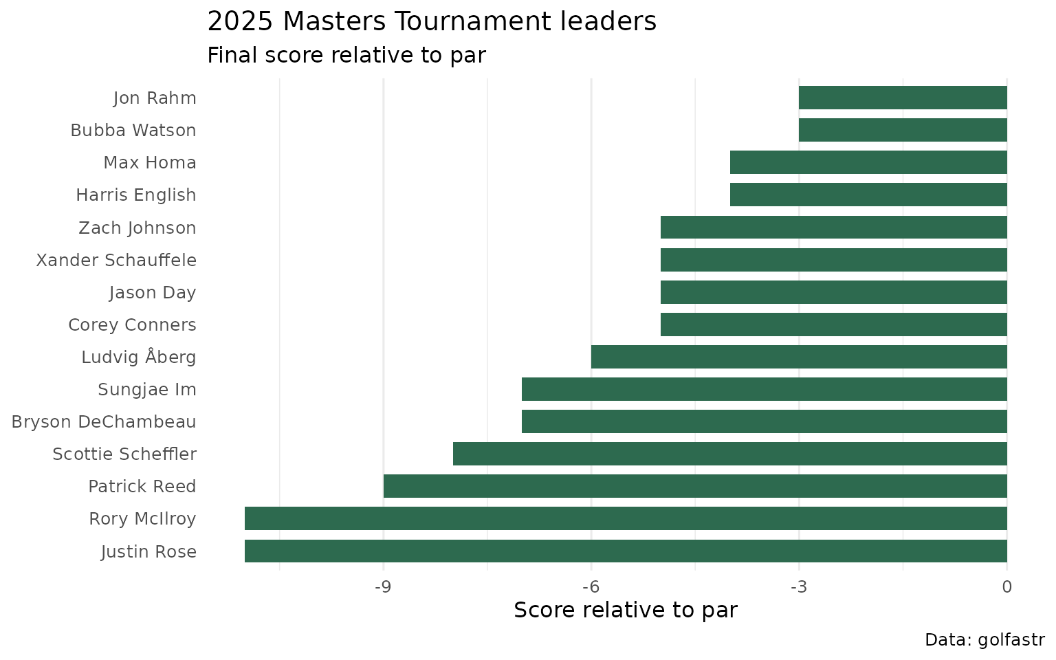
You can use the same code for another tournament. Change the year and
tournament name in load_leaderboard().